10 Premier League clubs that have changed their logos
A crest or logo is an indelible identity for a football club, evoking its historical significance every time you look at it. As the most relatable footballing term ‘playing for the badge’ signifies, the logo embodies a club’s history, roots, cultural significance, heritage, fans, players and pride. However, owing to the football clubs’ long history, making altercations often to their logos has become a norm.
Regardless of the criticism from the fans, the trend of changing the logo continues in the Premier League, with Tottenham Hotspur the latest club to do so. Let’s take a look at the other Premier League that have made changes to their badges.
List of Premier League clubs that have changed their badges
| Club | Updated Year |
| Arsenal | 2002 |
| Chelsea | 2005 |
| Brighton | 2011 |
| Everton | 2014 |
| Manchester City | 2016 |
| West Ham United | 2016 |
| Brentford | 2017 |
| Crystal Palace | 2022 |
| Aston Villa | 2024 |
| Tottenham | 2024 |
10. Tottenham Hotspur (2024)
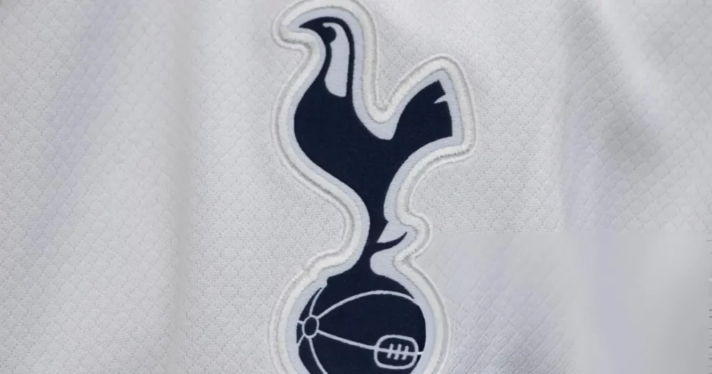
Tottenham Hotspur caught the public eye recently by unveiling their upgraded logo on November 18. There’s no huge difference in to spot as the club’s standard Cockerel crest remains intact, while the title Tottenham Hotspur has been removed and the logo’s size has slightly increased. Therefore, the rebranding has not gone well with the fans, who have questioned the club’s statement on the new logo “embracing its rich history and unmistakable heritage.”
9. Aston Villa (2024)
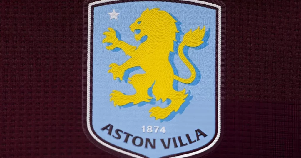
Aston Villa’s dilemma over their crest continued with yet another change ahead of the 2024/25 season. The first change to a long-used badge occurred in 2016, with the word ‘Prepared’ and the Claret outline being removed. Villa shifted to a new round logo in the 2023/24 season, marked by the Lion in the crest getting flipped to the opposite side. But the design didn’t last long as the Villans decided to make another change earlier this year, ditching the round design and placing the club’s name at the bottom below the founding year 1874.
8. Crystal Palace (2022)
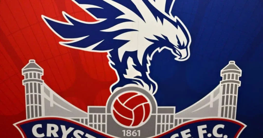
Crystal Palace made one of the most subtle changes to its logo that you would ever see in 2022. Having used a predominant design from 2013 featuring the notable Eagle symbol, the updated crest changed the founding year from 1905 to 1861, following an extensive search by the club’s historians.
7. Brentford (2017)
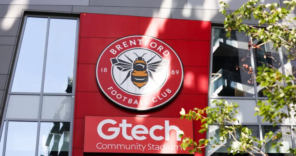
Brentford rolled out their brand new badge ahead of the 2017/18 season, thus leaving behind their old badge which had been in existence since 1993. With a view to having a more recognisable logo, the Bees scrapped their old design and introduced a new crest bearing a simplified honey bee – a tribute to the club’s nickname – over a red ring, which includes the club’s name and it’s founding year 1889.
6. West Ham United (2016)
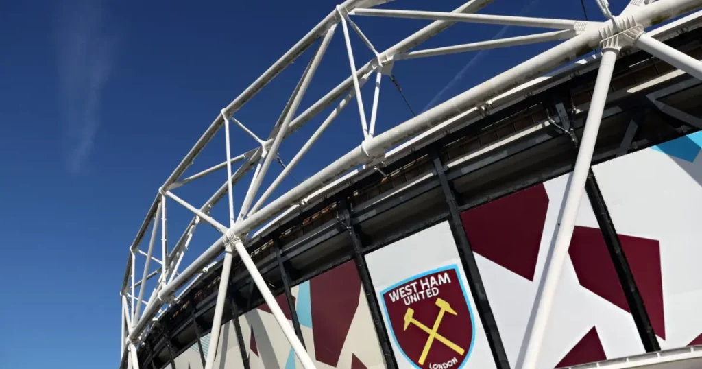
West Ham United made a major update to their logo in 2016. The traditional crest exhibited the Boley Castle and two hammers, but the historic stately home was removed in the new design since West Ham moved from the Boleyn Ground to the new London Stadium that year.
Additionally, the club’s title was moved to the top of the crest, with the name ‘London’ introduced at the bottom, signifying their status as one of the top clubs in the capital city. The shield resembles the bow of the historic and the world’s first warship HMS Warrior, built at Thames Ironworks, whose factory team formed the first-ever West Ham squad.
5. Manchester City (2016)
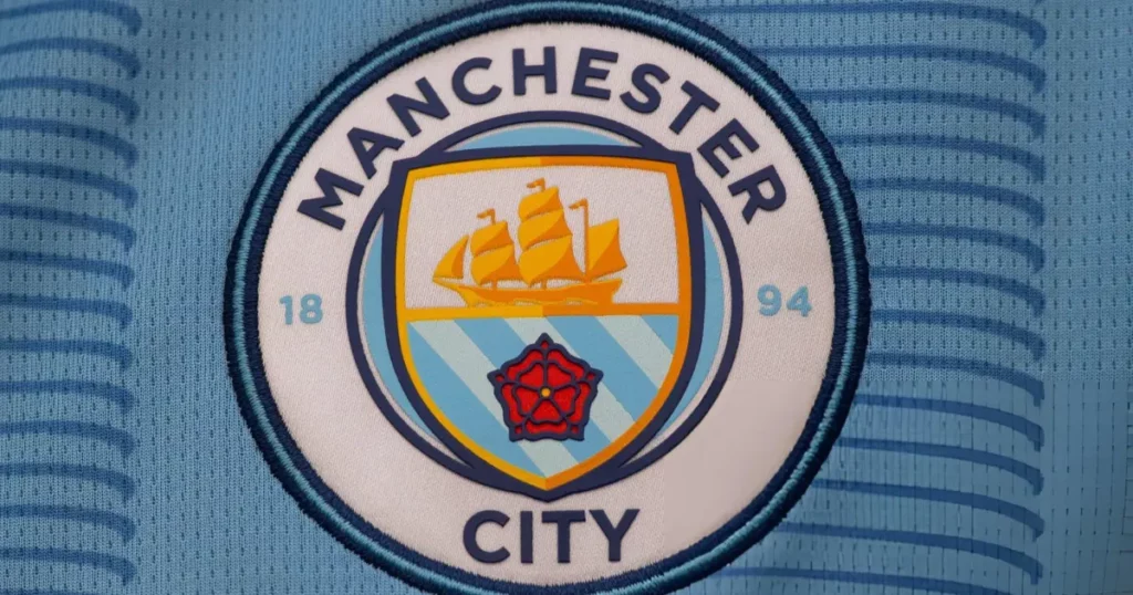
Manchester City’s defining era under Pep Guardiola also coincides with their more recognisable badge. The rebranded logo was rolled out in 2016 – a similar design was used between 1960 and 1997. The old logo consisted of an eagle, the arms of the city of Manchester and a shield, as well as three golden stars, which were all scrapped in the new design. The present badge, however, retained the shield featured a golden ship and three stripes, denoting the three major rivers of Manchester.
4. Everton (2014)
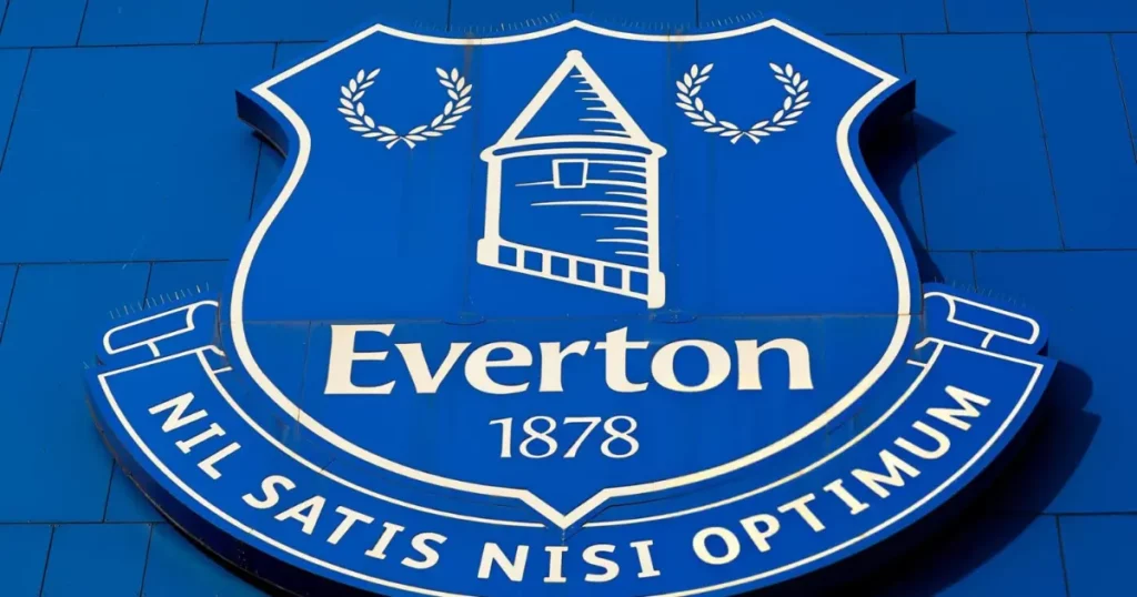
Everton’s logo underwent a series of changes in the past, with the current design introduced in 2014. However, the famous Everton Lock-Up and the Latin phrase ‘Nil Satis Nisi Optimum’ – which means ‘Nothing but the best is good enough’ – has been a prominent feature in their logo. Both elements were absent in 2013’s ill-fated design, but after a severe backlash from the fans, the two were incorporated again in 2014. The current design was also a work of the Toffees faithful.
3. Brighton (2011)
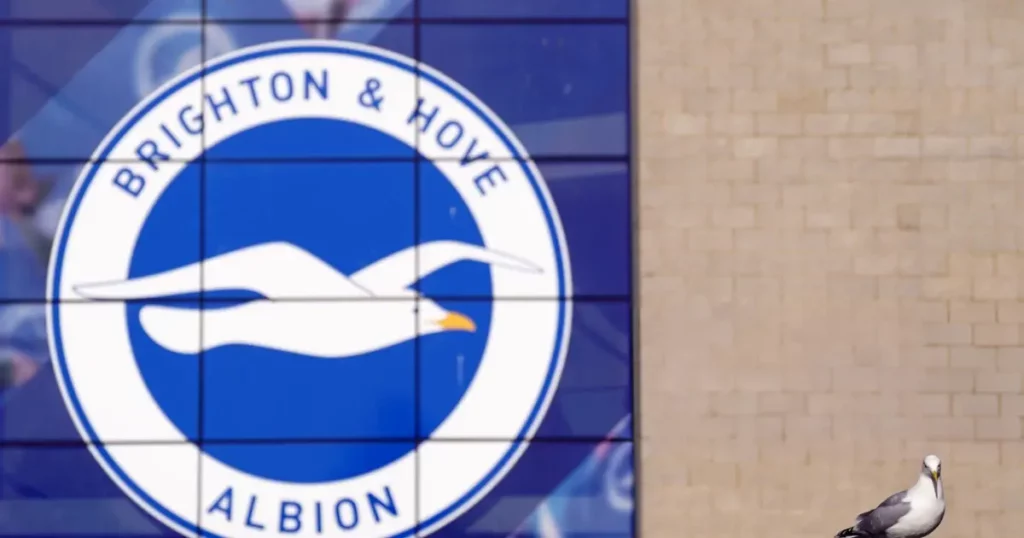
As Brighton & Hove Albion ushered into a new era after moving from their old stadium to the new Amex Stadium in 2011, they also updated their crest, resembling the one that had been in use between 1970 and 1990. The previous version primarily featured a blue-coloured shield with red around the outside, but the Seagulls opted for a round design featuring a lone seagull in their current logo.
2. Chelsea (2005)
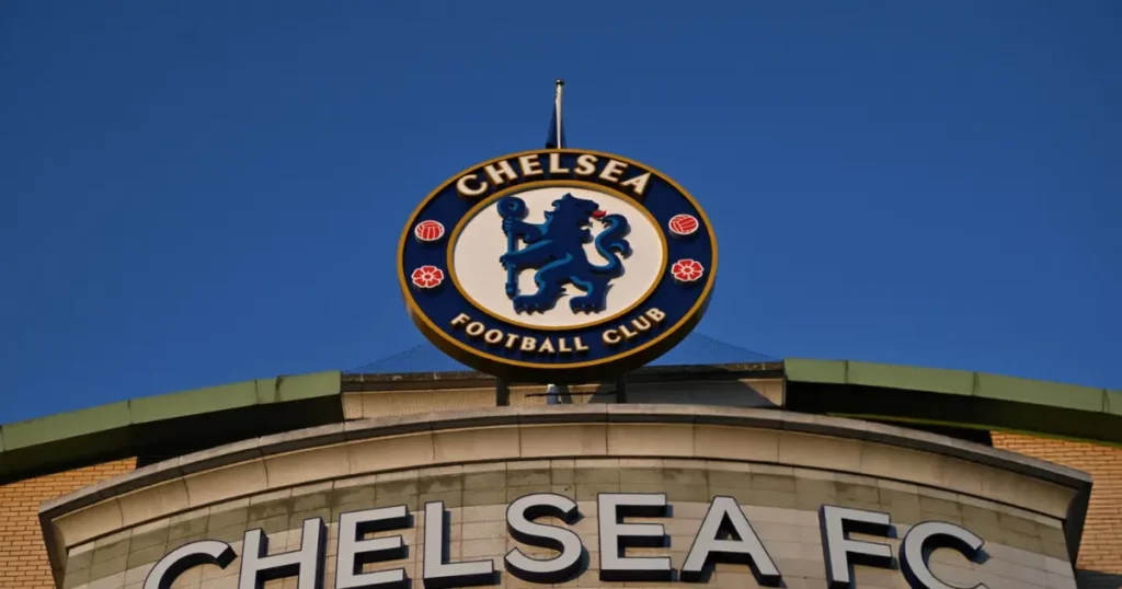
As one of the most successful clubs in London and the Premier League, Chelsea’s infamous round logo has been active since 2006, which was brought in to honour the club’s 100th anniversary. The logo took inspiration from the design created by former legend Ted Drake in 1953, who brought in several changes to the club, including the idea of the trademark lion in the crest. The logo has since become synonymous with Chelsea and is also widely considered one of the eminent ones, with the Blues’ popularity extending the boundaries following their dominance in the last two decades.
1. Arsenal (2002)
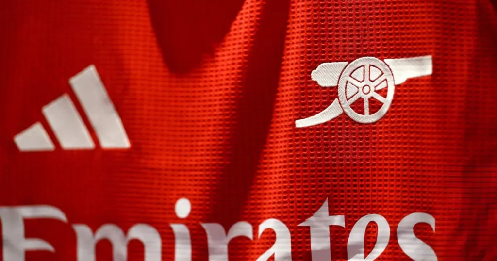
There are only a few logos which could match the minimalistic yet emphatic design of Arsenal. One of the most popular badges in the world, Arsenal have been using their crest since 2002. Scraping the Latin motto, ‘Victoria Concordia Crescit’ – ‘Victory grows out of harmony from their old logo, the current design features the vibrant cannon symbol, a military reference to Woolwich, the early home to the club. However, the 2024/25 season has seen the Gunners replace their traditional badge with the iconic cannon alone on their shirts.
FAQs
Q. Did Arsenal change their badge?
A. Yes, Arsenal changed their club badge for the 2024/25 season.
Q. What team has never changed their logo?
A. Manchester United, Newcastle United and Ipswich Town are the only teams that haven’t changed their logo since 2000.
Q. What is the most beautiful football team logo?
A. Arsenal has the most beautiful and minimalistic team logo.
